UI/UX Considerations for Event Websites, Part 1: Why Content Creators Should Care

Imagine a potential attendee has landed on your homepage for the first time. They’re considering your show and possibly two others. They are immediately distracted by various pop-up ads, complicated hero sliders transitioning way too fast and an endless sea of content. Frustrated, the user gives your event one last chance by surveying the top navigation to check out registration pricing and speaker details — but sadly, these items are hidden beneath three layers of navigation and odd naming conventions.
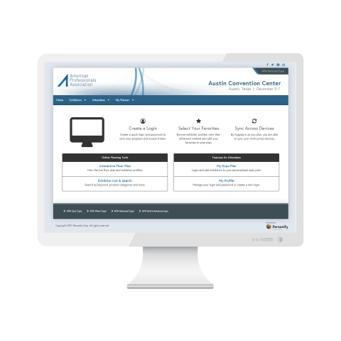
This is a snapshot of what users may experience when it comes to event websites. We’ve rounded up several best practices and concepts to guidelines to optimize the experience for users when planning for your next event.
Provide clear event details.
Where is your event held? What are the show dates and times? How can an attendee or exhibitor contact the event organizers if they have questions? This one seems pretty obvious, but there are many event websites that overlook this step.
Prioritize your most important content.
We know you have a lot to say to your audience and a limited amount of time to convey it. Try using a rotating navigational menu for your most important messages throughout your show cycle to simplify options. Also consider limiting your navigation to six or eight menu items (or less) with one layer of dropdowns for related content. That way, users can find what they need quicker. There is an emotional satisfaction we experience when we are able to locate exactly what we’re looking for.
Make naming conventions consistent.
Content will forever be king, but without a consistent tone and language, it is without a crown. Consider and re-consider what your navigational items should be called. Make note of these names and do not stray from this formula. If you’re calling it an exhibitor console a year out from the event, it should be called an exhibitor console up through show week. Most users will visit your site multiple times for various reasons, so make it easy to remember where they left off.
Simplify the interface.
There’s no other way to say this:.“Don’t make me think!” Users don’t need to experience every single aspect of the show on your homepage. Break down your top three or four priorities for the show and start building from there. Break up your content dividers with areas like testimonials or a sponsor carousel. A well-thought-out site should provide your users what they are looking for within the first 20 seconds they are on your site.
The events industry is constantly evolving, and competition within this space is more nuanced and intense than ever. Creating relevant and fresh content to increase engagement and drive registration will always be a priority; taking a step back to understand the value and importance of your user’s experience (UX) is the key to a successful and engaging event site. Be on the lookout for part two, coming soon.
Need a high quality, user-friendly, event website for your next event? Learn how Personify can help you develop a website for conferences, expos or commercial events.


Add new comment